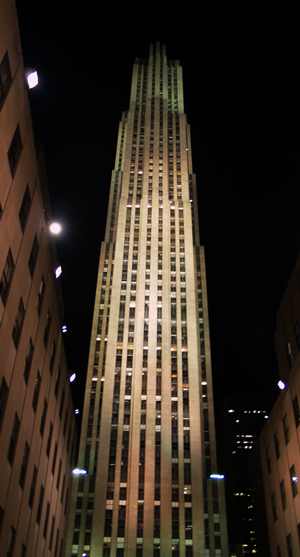
 Ray Hood’s RCA/GE Building is the the tallest tower in Rockefeller Center.
Constructed in the depths of the depression the building derives beauty from a simple metaphor for the worker — carrying people efficiently and safely to a well-lit space.
“As each elevator shaft ended,” Hood explained in Architectural Forum, we cut the building back to maintain the same 27 feet from the core of the building to the exterior walls. By doing so we have eliminated every dark corner. — Great Fortune by Daniel Okrent
Hood’s design emerged from a set of constraints: the number of elevators required, the achievable height of an elevator shaft, and the distance one can sit from a window in New York and still receive natural light. The resulting setbacks thin the tower as it rises achieving elegance without ornament and lightness despite a massive stone facade.
What an achievement for a man who died at 53 while Rockefeller Center was still under construction.
But even the most expressive, inevitable metaphor loses coherence across implementers and over time. His fellow project architects crafted some blocky companion towers. Inside “30 Rock”, I’d bet seventy years of renovation have thrust some employees into the shadows.
