Tag Archives: usability
Verizon Wireless website is… (sorry)

This is the page that comes up when the Verizon Wireless customer portal is unavailable.
At least, that’s what I infer because nowhere does the page actually say this.
Rather it tells me I can browse their marketing site while at the same time listing all customer options in the top navigation. Clicking on account links like “pay bill” simply returns you to this page.
Only after logging into their site with more than one browser did I notice the title of the page is “sorry.jsp”.
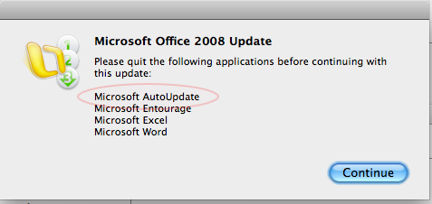
Update requires that you quit update

I realize Microsoft AutoUpdate and any particular Microsoft Office update are two different executables but since the first launches the second, this dialog box strikes me as a plea for assisted suicide.
The fact that it always comes up makes me think Microsoft could have spent time on a more elegant solution.
That fact that the naming and iconography is so confusing that I’ve accidentally killed the update instead of the auto-updater requiring me to start all over again is infuriating.
Constraints, metaphor and beauty
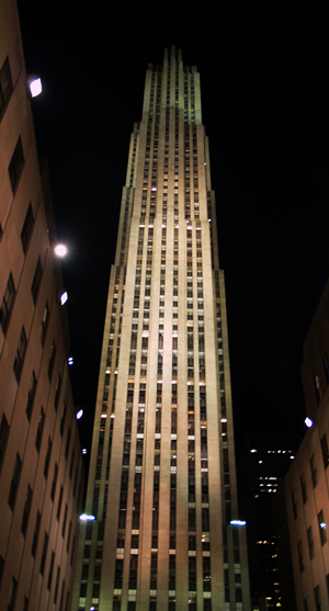
 Ray Hood’s RCA/GE Building is the the tallest tower in Rockefeller Center.
Constructed in the depths of the depression the building derives beauty from a simple metaphor for the worker — carrying people efficiently and safely to a well-lit space.
“As each elevator shaft ended,” Hood explained in Architectural Forum, we cut the building back to maintain the same 27 feet from the core of the building to the exterior walls. By doing so we have eliminated every dark corner. — Great Fortune by Daniel Okrent
Hood’s design emerged from a set of constraints: the number of elevators required, the achievable height of an elevator shaft, and the distance one can sit from a window in New York and still receive natural light. The resulting setbacks thin the tower as it rises achieving elegance without ornament and lightness despite a massive stone facade.
What an achievement for a man who died at 53 while Rockefeller Center was still under construction.
But even the most expressive, inevitable metaphor loses coherence across implementers and over time. His fellow project architects crafted some blocky companion towers. Inside “30 Rock”, I’d bet seventy years of renovation have thrust some employees into the shadows.
Usability peeve
I helped my in-laws with online NW Airlines check in. Turns out the resulting boarding passes don’t page break correctly when printed from a mac. I had to increase my viewing font-size in safari in order to avoid passes running off page one and continuing on page two.
How easy could it have been to do a print format that works? They must not have even tested on macs nor did they alert me my browser was invalid.
Something else – the url of their thank you page is “CheckInFailed”

